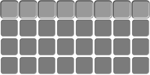
I recreated the original layout as best as practical, but by necessity
there are a few minor positioning changes, since the underlying
hard-wired inventory slots are square now and image positioning is now
scaled by exactly 1.250 in both dimensions (as opposed to roughly 1.25
by 1.16).

Backstage, I also needed to fix the aspect ratios of the various
inventory slot elements.  That meant redesigning the single-slot image
from scratch.  It was already blurry/grainy and a little ugly, and
trying to alter it would have only made it worse.

The slot image is now exactly 56x56 pixels square, set on a 64x64
canvas, so there's a 4 pixel empty space around the edges. The full
256px .xcf workfile is included in the UI folder.

I've re-tiled all slot/inv images from the new single slot.

I also re-rendered the trash can icon from it since it was blurry and
oddly-sized. I couldn't find the original upstream image, so since
they're free, I used one of my Linux system's icons which happens to
resemble it.

I also removed a couple more improper uses of `background[]` where
`image[]` is more appropriate.

There are tons of minor tweaks throughout the code to re-align
everything, and I had to rewrite a few sections to avoid code
duplication and to allow for a little more flexibility (mainly to make
"lite" mode look right).
3.8 KiB
512x256px
3.8 KiB
512x256px
